WEEK 12
PREPERATION
Co-Design?
I wasn’t familiar with the concept of co-designing until Andreas brought it up in my feedback session last week. Now that I know more about it, I believe that incorporating co-designing into my project will be advantageous because of:

01
User-Centered Solutions
The inclusion of the visually impaired in the design process contributes to the designer’s education and the reduction of ubiquity in design decisions, bringing them closer to the real needs of users.
02
Faster Iteration and Feedback
I can receive feedback faster and make adjustments in real-time, which will speed up the design process and reduce the likelihood of revisions later on.

03
Community Building
Can build a sense of community and trust between designers and visually impaired. It shows that their opinions and voices are valued.

04
Ethical Considerations
It’s ethically responsible to involve the people who will be directly affected by my design choices. Co-design ensures that decisions made about my prototype are not imposed on users, but are made in consultation with them.

“It is important to study co-design methods and instruments to enable their implementation, broadening the understanding among all the multidisciplinary team and reducing time and costs in the design process, to contribute to the quality of the process and of the final product”
- Caixeta and Fabrício (2018)


SLIDER IDEATION
What could be interesting to interact with? Can I create something less predictable? How can I push the
boundaries of the conventional appearance of a slider?
I will try to look into other aspects of design. Maybe I can draw inspiration from unconventional sources,
just as I did for the buttons (inspired by bath bombs). I think that the value of unconventional
approaches to design can be a differentiating factor and
generator of new areas of though and action. This is why I’ve been contemplating how I can create my
slider in alignment with this perspective.
-
02
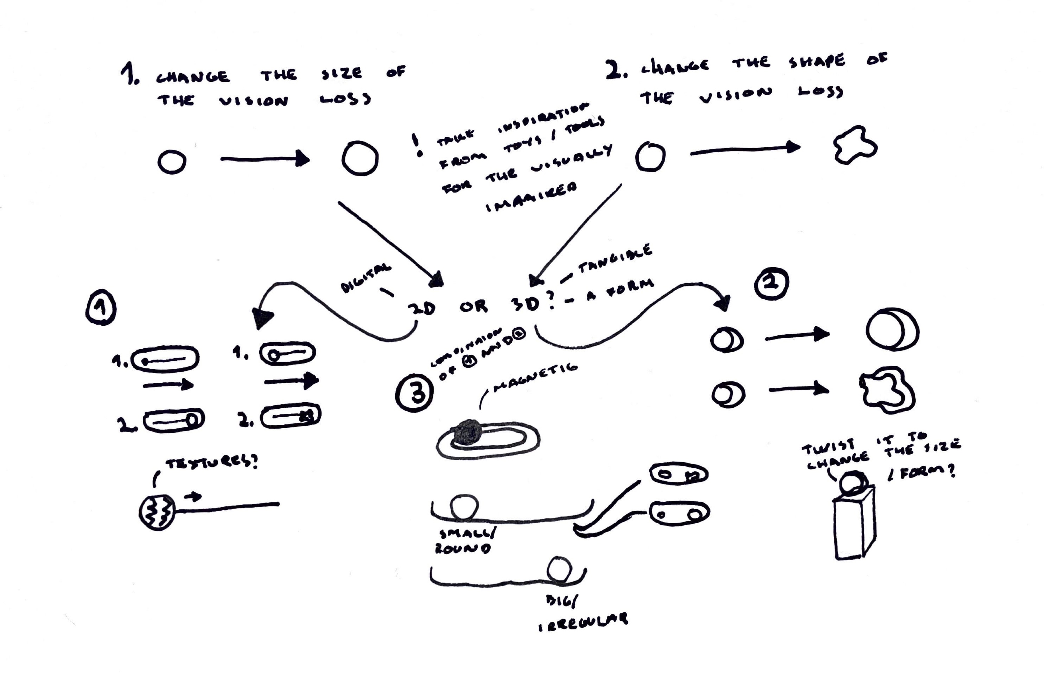
The slider will take on a 3D form, resembling a sphere. This sphere will change in both shape and size as it gets twisted. Similar to the precious idea, the challenge is how the shape is going to change.

-
03
The slider will be engraved into a board, like a pit. Positioned on top will be a contuctive sphere that controls the interface based on where the sphere is placed on the slider.
01
A digital slider featuring an interface that transforms as you drag. If the slider is not digital, it can be a flat slider with textured controls. The challenge will be how the shape will change if the slider is physical.
After Effects Slider
Visualising my idea in After Effects instead of p5.js to save time on figuring out how to code the animation.
Experiement. It's been awhile since I used After Effects, so I made this short sniplet to get more comfortable with the program.

Idea for Slider #1
Slider 1. Change of size.
Idea for Slider #2
Slider 2. Change of form.
OVERALL REFLECTION
The exploration in After Effects follows a simple approach for a slider, providing a visual representation
of my current idea. Faced with the decision between a digital and a physical slider, I wondered why not I
combine aspects from both ideas together into one final one.
Personally, I find my third idea appealing because it integrates elements from both the first and second
idea. I think by having a tangible interface can reduce the cognitive load and improve usability. I’m also
drawn to the idea of the user interface being achieved not only with a screen, but also with a physical
object that can be touched.
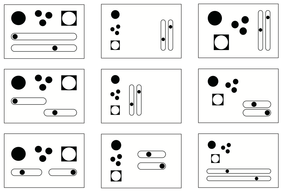
There are many approaches to arrange the buttons and slider together. I’ve experimented with different positions to find a layout that not only distinguishes them from each other, but also clearly indicated that both the buttons and the sliders are integral parts of the interface.
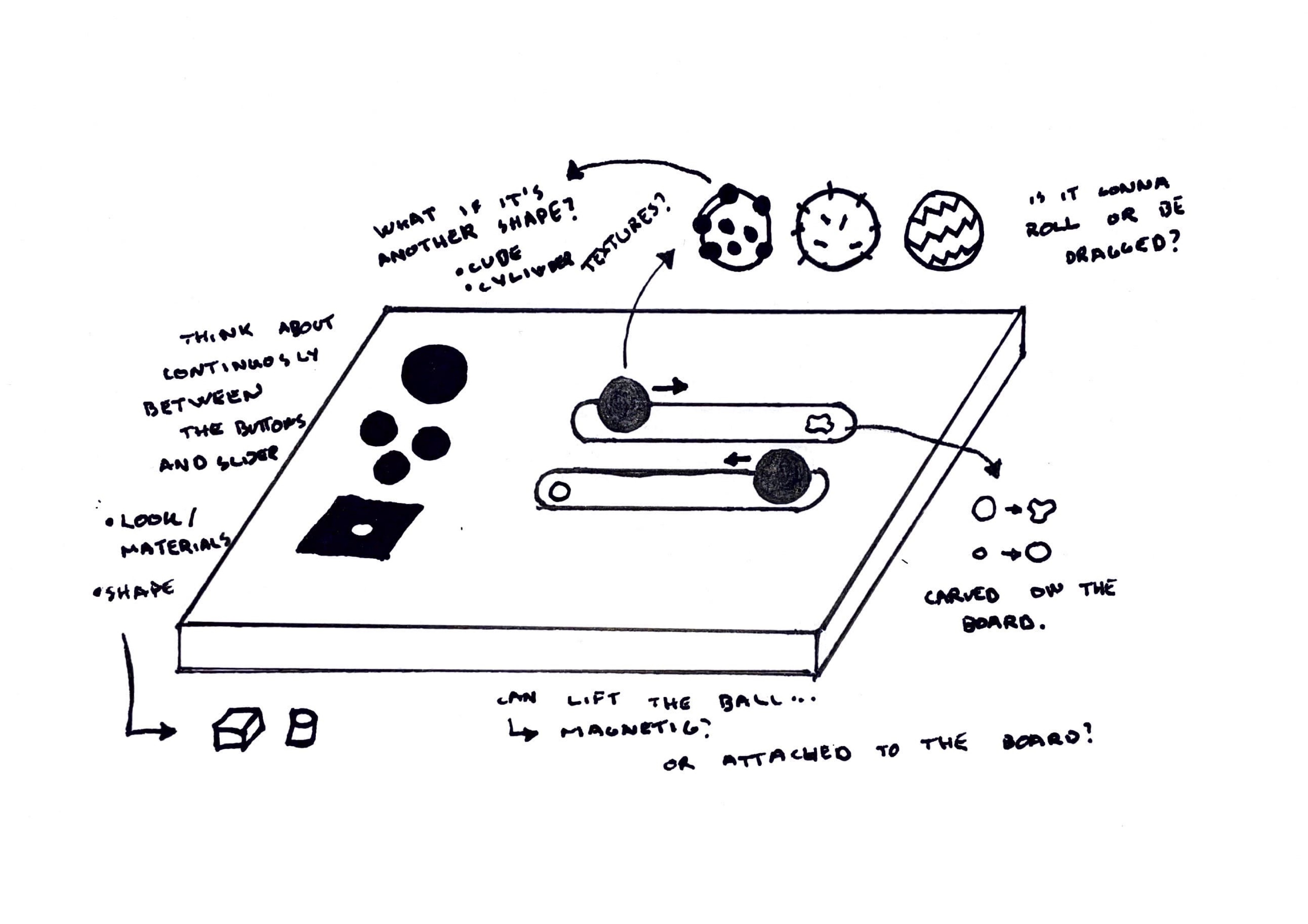
In my opinion, I think this position will generate smoother navigation and initiate haptics. However, as I haven’t done any user testing, this will most likely change in the future, pending on the feedback I get after conducting user testing of my first prototype.

USER TESTING OF MATERIALS
Scenario:
You are a designer using a toolkit which aims to help you with designing for the visually impaired. The buttons presented in front of you are buttons which are going to be a part of the toolkit.
Explain how you feel when touching each material.
What are the three materials you like the most? Why?
What can be improved to make the touch feel better?
Any improvements on the look?


Dennis
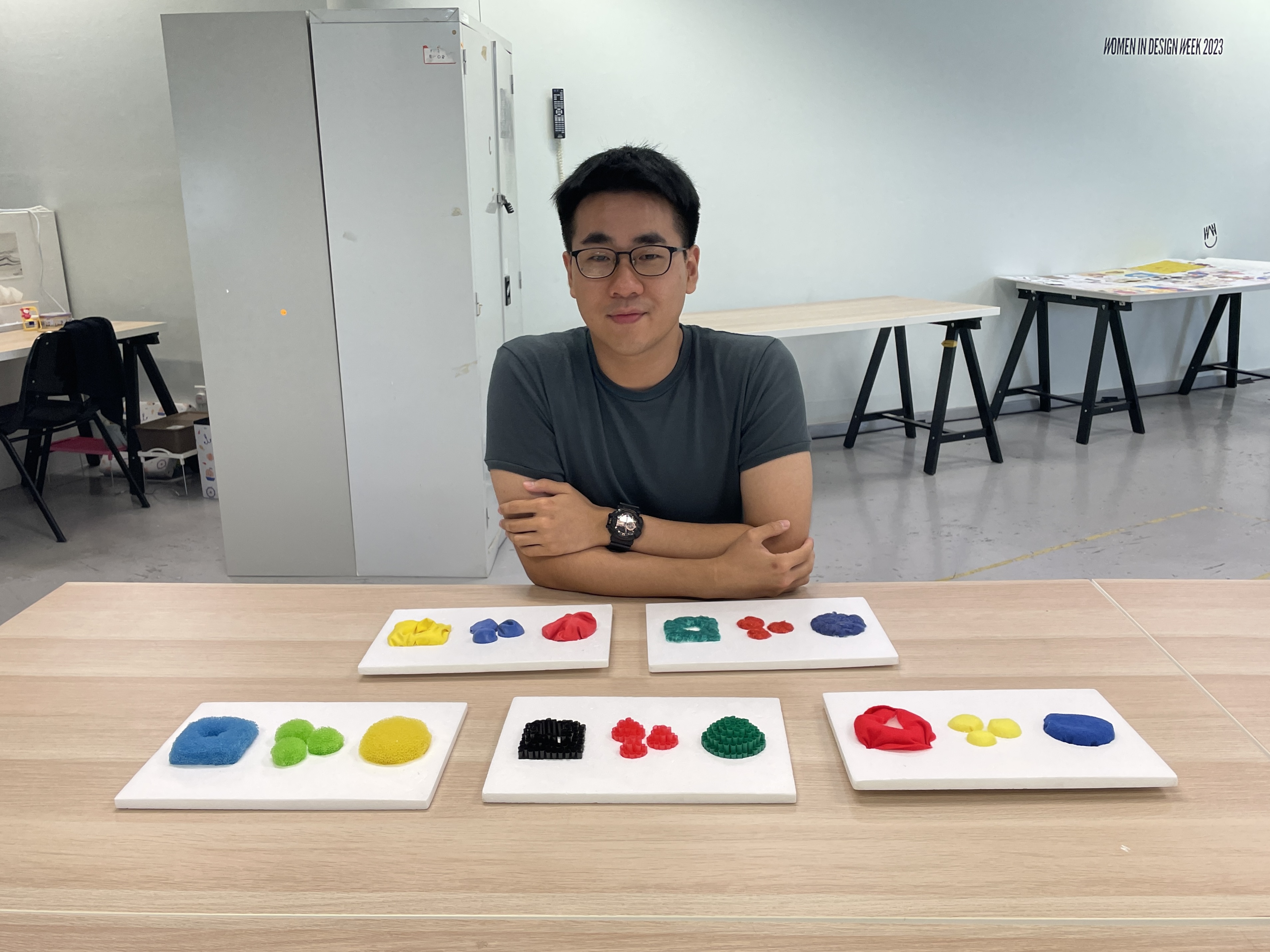
Cotton balls
- The cotton balls are nice to touch, but in terms of long-term usage it might get dirty.
- Comforting to touch the material, but the bumps makes him feel uncomplete.
- A suggestion is to make it smoother.
Balloon
- It feels nice, but he would prefer something haptic.
- Prefer a fidgety material or mechanism that provides a sense of “fidgyness”. He needs to know that he’s
clicking the button.
- Texture is fine.
Felt
- Compared to the cotton balls, he likes this one better.
- It gives him a sense of comfort.
- The material is better because it has less obstruction and feels more smoother.
- It might be more efficient than the cotton balls.
Straws
- Don’t like it. It hurts his fingers.
- Instead of holes, maybe cover them up or choose another material instead of straws.
- Likes that it’s solid. He prefers solid over a soft button.
Sponge
- This is his favorite.
- It feels like a bouncy ball.
- It doesn’t hurt, no discomfort.


Jamie
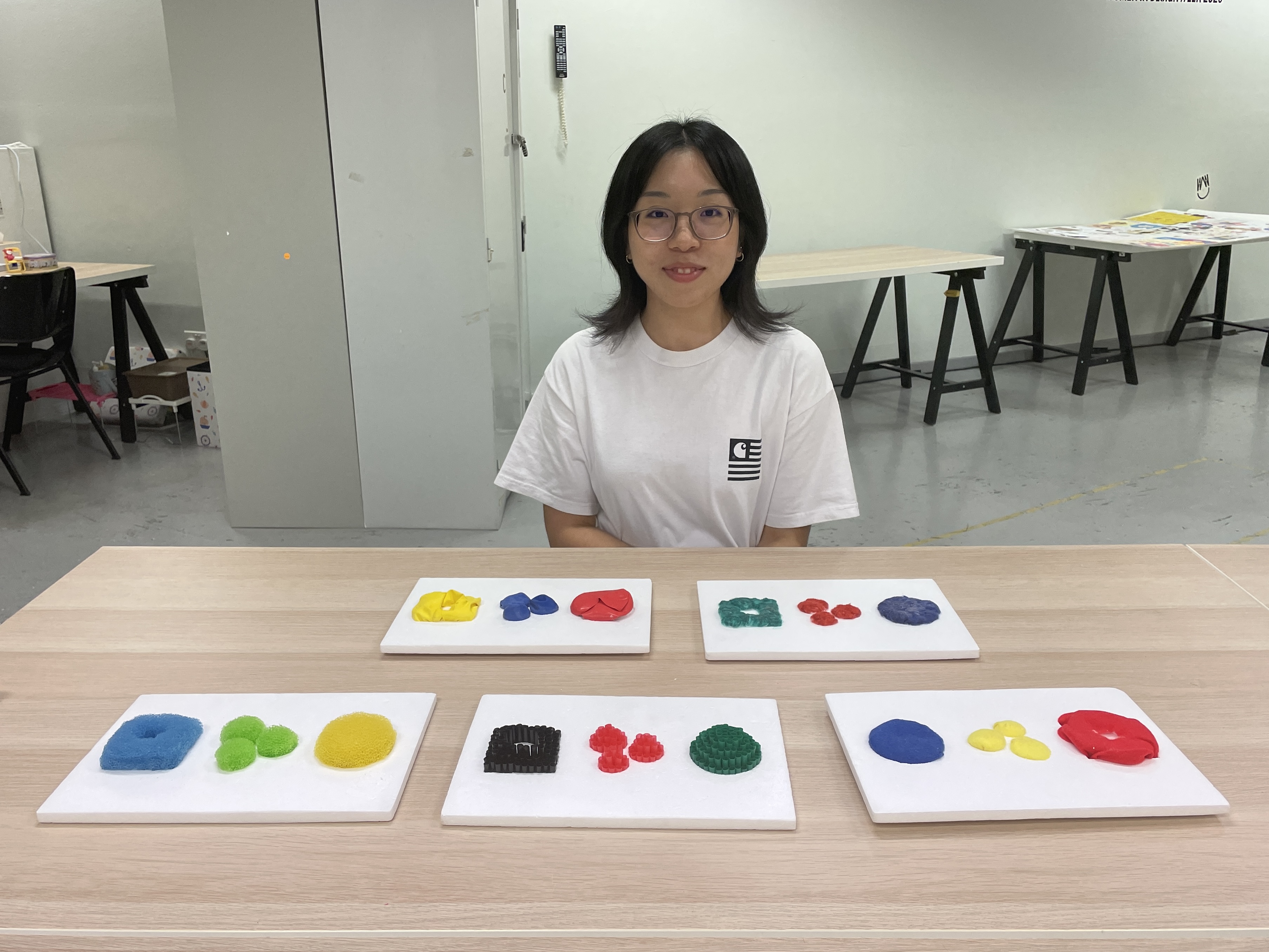
Cotton balls
- Pretty unconventional for a button to be soft.
- It’s firm, but she wants the feeling of the button to be pressed down.
Balloon
- The red one feels more like a button because it’s more full.
- More fun.
- Likes the bounce the buttons gives off.
- Suggestions are to make it more stretched out. Right now it feels like loose skin.
Felt
- Even if it’s firm, it feel softer than the cotton balls because it’s more packed.
- Feels more “buttony”.
- Prefer this one over the cotton balls.
Straws
- Sharp
- A bit uncomfortable, but it feels more like a button – especially the red one because of the shape.
- The material is a bit distracting because there are a lot of edges. The button could work better if they
were smoother.
Sponge
- Like the bounce and squish.
- Prefer the round shape compared to the two other ones.


Medha
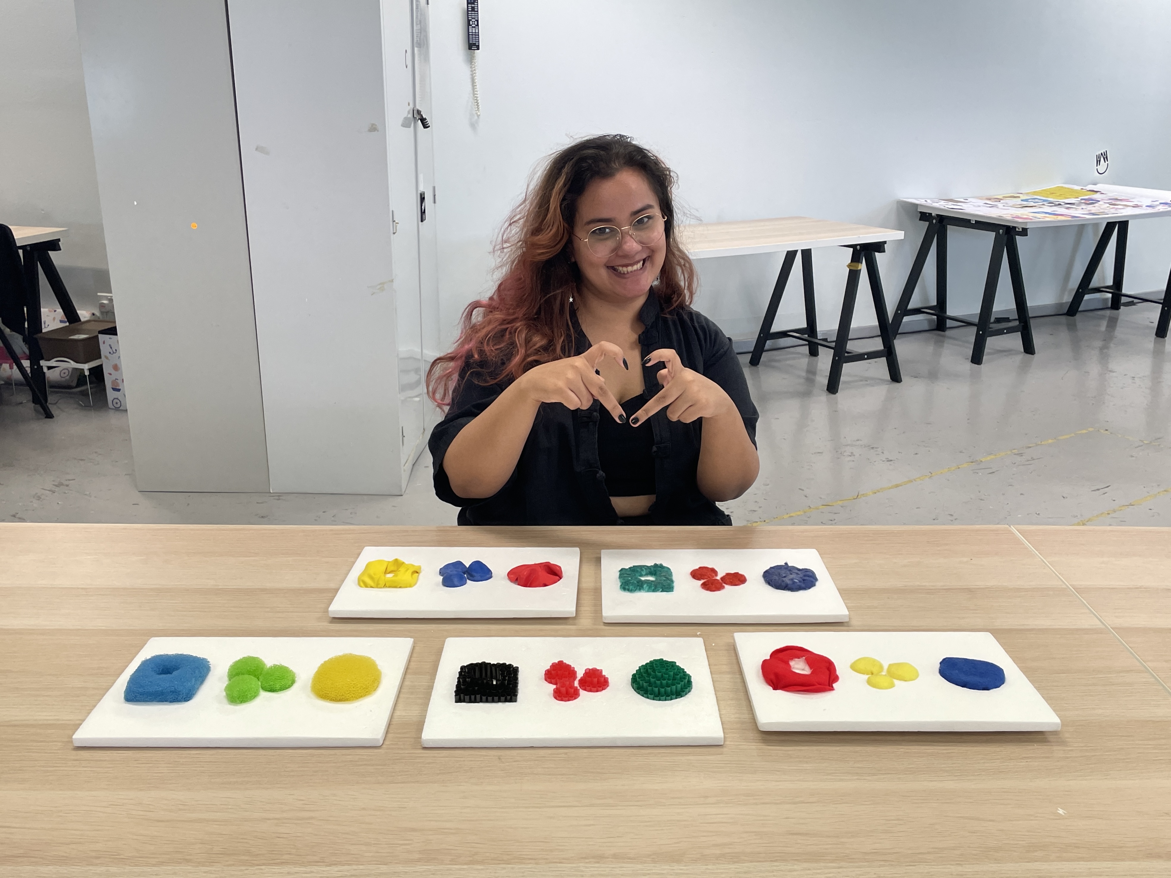
Cotton balls
- Do like it, but also feels like it won’t be something she will interact with because the material isn’t
anything special.
- Interesting because the material is irregular and soft.
- Would not interact with it for too long.
- Comforting to press, but would like more texture. The part where it is irregular, she finds more
interesting.
Balloon
- When you look at the material, it looks soft, but it’s actually not,
- Would be nice to touch if it was bouncier.
- She likes this material more than the cotton balls.
- She likes the idea of it being squishy without being soft.
Felt
- Likes the cotton balls more than this because this material is very predictable – you can see what it
is and how it feels.
- The previous two have irrefularity that makes her want to explore them, while with this one, there’s
nothing special when she touches it.
- Could be interesting if there were folds in the material.
Straws
- Likes this one a lot because the material is an unconventional material.
- She can tell they are straws, but it doesn’t feel odd.
Sponge
- She likes this one because it a nice in-between the straws and balloon. Ideally, she would love
something like this.
- Suggested to have a different material for the square shape.


Shalom
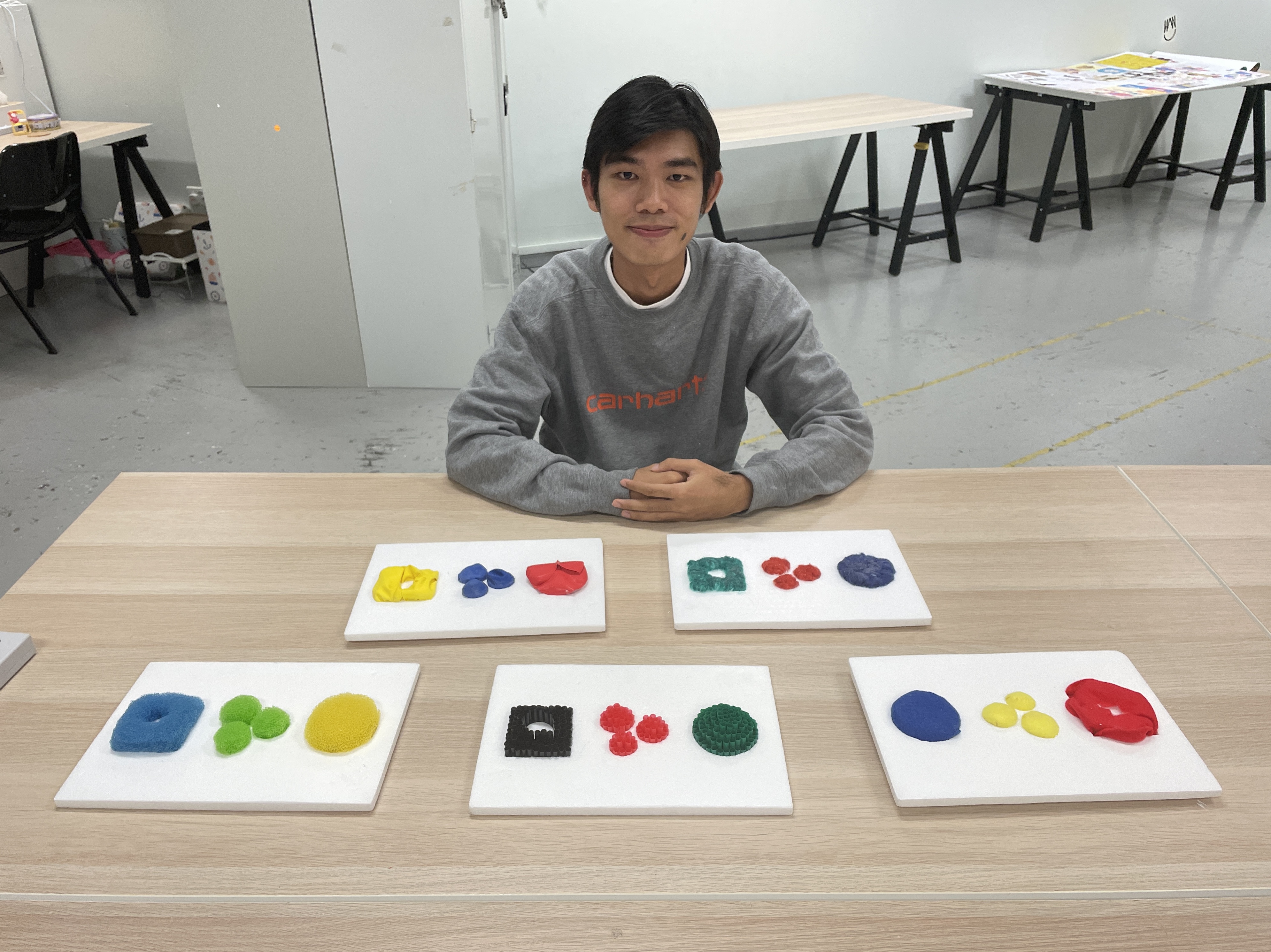
Cotton balls
- The texture makes him want to pet it.
- Wouldn’t know if he’s activating the interface because it’s sensory and not a button.
- A lot of human errors involved when accidently touching it?
Balloon
- Slightly better because you can feel the depression when he pushes it down.
- Maybe a sound will help knowing you have clicked it.
Felt
- Quite similar to the first one.
- Prefer the felt compared to the cotton balls because it feels you can press it down.
Straws
- Like the elevation and the dome shape.
- Only the red one feels nice because of the shape.
- Texture wise, it is interesting, but not that not comfortable to press it because of the edges.
Sponge
- He thinks it’s fun.
- Have to put in a bit of force to press down, which might be a hassle, but he likes that it goes down a
lot so you knows that you are pushing it.


Tanishqa
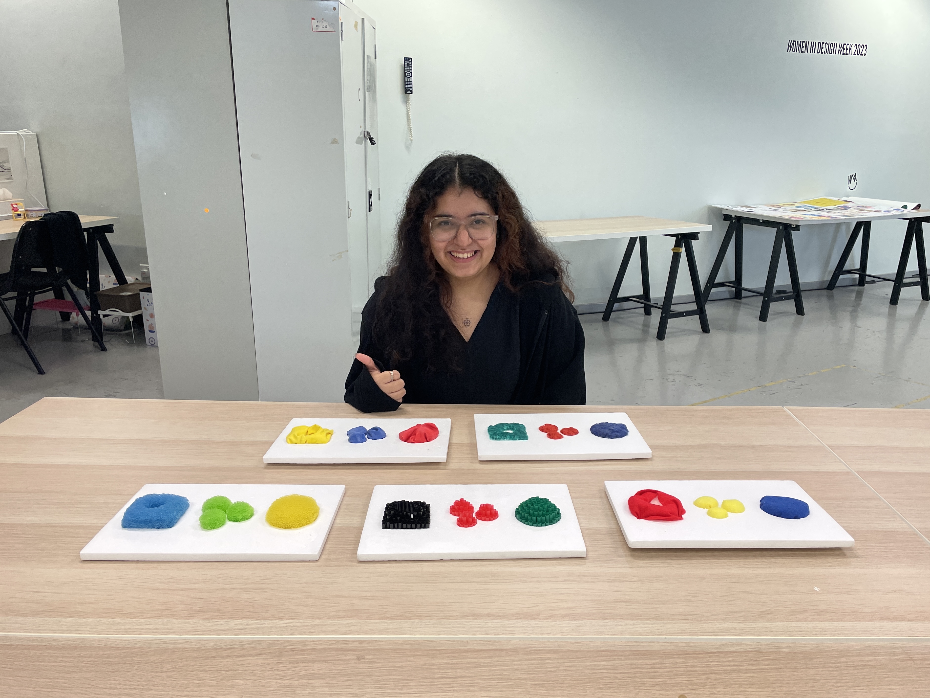
Cotton balls
- Like it for the sensory, but not as a button.
- Don’t feel anything.
Balloon
- Having different materials beneath it, would be interesting. Interesting if you can touch and can’t
identify what’s beneath it.
- Can get uncomfy to touch it, but gives her a nice texture, so she enjoys it much more than the cotton
balls.
Felt
- Similar for the cotton balls. Not much to say. Doesn’t give a lot of textures.
- It doesn't do much as a button. Just normal.
- Maybe use a conductive fabric makes it easier if I’m implementing technology into it.
Straws
- Fun, very acupuncture. It feels like it’s massaging her hand.
- It doesn’t hurt.
- Something new to feel. It is a different material she wouldn’t expect.
- Like it because she doesn’t expect straws as buttons or anything, especially put together.
-Fun to look at, cute.
Sponge
- In terms of buttons, this will definitely work.
CONCLUSION
No. 1 = 3 points
No. 2 = 2 points
No. 3 = 1 point
D = Dennis
J = Jamie
M = Medha
S = Shalom
T = Tanishqa

Cotton balls
Balloons
Felt
Straws
Sponge
3(M) 3(J)
2(T) 2(D) 2(M)
3(D) 1(S) 1(J)
1(T) 3(S)
3(T) 1(D) 1(M) 2(S) 2(J)
2
6
7
4
12


Favorites in order:
1. Sponge (12)
2. Felt (7)
3. Balloon (6)
4. Straws (4)
5. Cotton balls (2)

Key takeaways from the user testing:
-
05
Material wise, a cloth material would not be ideal because of the fibers will absorb liquid easily, like sweat or water. With the other materials, it’s easier to clean.

01
The reason why the sponge is the overall favorite is because of its resemblance to a bouncy ball– soft and squishy. The material adds an element of enjoyment to the interaction, especially due to the visible difference between the original form and the form while it’s pressed. This distinction is good, as user can easily discern when they are pressing the button.

02
The felt placed second, but there are mixed feelings about it. I got surprised by its overall ranking, especially since it’s the top material for two of the users. However, there were no specific explanations provided for their preference, aside from its soft texture.

03
Judging by the general feedback on the ballon, it appears that people found it more enjoyable than the felt, even though it ranked lower. A lot of suggestions were offered, with a common suggestion being the desire for increased squishiness. While being squishy, there should also be a haptic element incorporated.

04
Most would prefer a hard button than a soft one, unless there is some form of acknowledgmen, such as a click, to confirm that an action has been done.


WEEKLY ROUNDUP
I am happy that the making of my prototype is moving forward. Having tested all the current materials, I
can now narrow down and refine the material I will use. The user testing has highlighted the important
role that materials play in the design process. Initially, I assumed that the balloon would be the
preferred choice, given that it’s my own personal preference. However, the feedback has revealed various
opinions that require improvement of the balloon as a material. Additionally, I’ve gained new insights
into the strengths and weaknesses of the other materials. I will use these feedbacks to help me with the
next step of making the buttons.
In the upcoming week, I plan to make more ideas for the prototype, with a particular focus on the
buttons and slider ball. Additionally, I will start experimenting with the physical form of the soldier
and hopefully make it work.